Watch and read his testimony on our Beyond Disabilities Page.
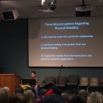
Beyond Disabilities Week: Brett Olson “Examining the mess under the carpet”
Reply

Watch and read his testimony on our Beyond Disabilities Page.


Here is the paper I submitted to the University of Pittsburgh’s The Disability Experience: State of the Arts in Research, Scholarship and the Arts. I will be presenting on the Accessible Icon Project at this conference on October 31st-Nov 1st.
Background:
Given the ability for image to influence perception, it is necessary to critically analyze how symbols shape the way one thinks about individuals in society. Through societal norms, people have grown accustomed to accept images without using the same analytical process to pick apart images in the way they do text. Therefore, one needs to be very intentional about examining what symbols are teaching society and what ideas are being reflected through symbols people see every day.
When applied to the typical blue and white handicapped symbol, one can see that this current symbol leads to thoughts of passivity and inability. The stagnant, robotic and lifeless structure of the current symbol reinforces the misconceptions that ability advocates are steering away from, yet no one has changed the symbol since 1968. One critical step for changing the stigma about people with disabilities is to alter public perceptions by changing the International Symbol of Access.
Methods:
The Accessible Icon Project is an international movement that has changed the handicapped sign into an image that is active and engaged. In 2009, Sara Hendren and Brian Glenney started a street art campaign in Boston to highlight the shortcomings of the current International Symbol of Access. After this was noticed by a writer in the Boston Globe, a new design was created in response to the feedback they received, and the team took on the new task of permanently changing the accessibility symbol. Since 2010, the project has grown from a grassroots campaign to a larger social design effort, now housed and run by Triangle. The icon has evolved from its first creation and now abides by ISO DOT 50 standards, a universally accepted icon set that determines the look of figures commonly seen on bathroom signage, and complies with ADA regulations.
Instead of having a symbol that looks lifeless and robotic, the Accessible Icon chooses to focus its design around movement. For example, the head is positioned forward to indicate the person as a decision maker of her/his mobility. The arm is pointing backward to suggest the dynamic mobility of a chair user, and the wheels are seen as being in motion to indicate the forward thinking of people with disabilities. The person in the wheelchair does not seem passive or robotic, but alive and determined. Compared to the stagnant figure constrained to the restraints of a wheelchair, the new symbol reinforces themes of life, energy, and determination.
People wishing to change their signs can easily do so with the help of the Accessible Icon team. Stencils and stickers are available online as well as connections to sign companies who produce metal signage with the new symbol. Direction toward buying proper paint and instructions for spray painting can be given by email or mail. Once an institution gains permission and agrees to switch the new sign, institutions generally plan an event around the painting. Members from the community join in discussion and painting, and lots of pictures are taken. At times, news services may opt to cover the story and ask community members questions about the project. The community should be prepared to answer why the Accessible Icon is important and why it makes a difference to people in the community.
Results:
Currently, the project is fortunate to have a number of partners who not only use the Icon in their buildings, but are also creating a stronger relationship with people with disabilities. For example, Partners like Clarks USA, Building Restoration Services, and BRS Cares are not only strong philanthropic supporters of Triangle but have chosen to increase their hiring of people with disabilities. Currently, multiple cities, businesses, hospitals, schools, and colleges in places such as Massachusetts, Washington, Arizona, North Carolina, Ohio, France, India, and the UK are engaged in a slow phasing in of the symbol. The symbol is being used when old signs need to be replaced or fixed and when institutions want to switch their parking signs for public support. The project is expanding across the United States and around the world.
Discussion:
The new symbol is part of a general attempt to bring about a public re-conception of what it means to have a disability. At the center of its design, the Accessible Icon was created to highlight movement. The artists intended the new symbol to raise awareness about cultural perceptions of disability and social inclusion in the US. Since people with disabilities are active and engaged in the community, the Accessible Icon Project believed it was necessary to represent people as such in pictorial form. Describing the new image with words such as: active, abled, engaged, ready-for-action, determined and motivated, the new symbol helps provoke discussion on how we view disabilities and people with disabilities in society. The symbol does not per se “represent” people with disabilities since not everyone is in a wheelchair, but instead represents that all people with disabilities can be active and engaged in the world.
Ultimately, the Accessible Icon Project wants the new symbol to spark conversation as well as illustrate the active and engaged role people with disabilities play in society. The new symbol should support disabilities advocates and help push for a more inclusive world. Changing the symbol is part of changing the universally accepted mindset about people with disabilities. Now people all over the world use the symbol to signal their wishes for more inclusive institutions, economies, and workplaces everywhere.